I believe you have heard of bitcoin if you haven’t lived on the moon in the last few years, but not
everyone has heard of Bitcoin’s Rainbow.
The value of Bitcoin fluctuates every day, and it’s easy to be afraid of the coin’s rapid highs and
lows. However, if we look at the so-called logarithmic chart, we can see the cryptocurrency’s
evolution versus the dollar since 2009 and a high-value trend over time.
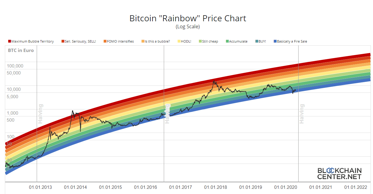
On blockchaincenter.net, the so-called Bitcoin Rainbow Chart, a logarithmic chart of the bitcoin
(BTC) price progression with colored bands has been presented on BlockchainCenter.
The colored bands were constructed using a logarithmic regression introduced by Bitcointalk
user trolololo in 2014, which was created by Über Holger, CEO of Holger and responsible for
the website’s content.
However, Holger admits that these bands are entirely arbitrary and without any scientific basis,
so they are only correct until they won’t be any more one day.
The chart, on the other hand, allows you to track price movements over time while disregarding
the daily volatility and gaining a sense of when the best periods were to buy or sell BTC in the
past.
Holger said that the Rainbow Chart is not investment advice because past performance
indicates future evolution but divides the bitcoin price into eight colored bands: bubble, sell,
FOMO, bubble formation, HODL, still cheap, accumulate, buy, and discounts.
The names of these bands are humorous, but behind the amusing and straightforward form of
this graph lies some truth.
The curve of the eight rounds seems too perfect not to make sense.
These bands seem to have given exciting suggestions on how to behave when buying or selling
BTC, although, as Holger says, this is not enough to know whether this will be the case in the
future.
First, both post-halving bubbles ended in the “bubble” band or beyond, while the three minimum
pre-halving levels have always been included in the “discounts” band.
However, some worries may come from the August 2013 peak, with the price at $180 being in
the “sell” area. True, the price dropped below $60 in June, but it was already back above $180
by November.
Other doubts may arise during the top in June 2019, when the price reached $13,000: the chart
only shows the HODL range, while the price had more than half by the end of the year.
Even when using historical data, these eight bands do not provide clear signals on when to buy
or sell, especially when the price curve reaches the extreme bands.
How To Read a Bitcoin Rainbow Chart
The color bands on the Bitcoin rainbow chart indicate when the cryptocurrency is oversold or
overbought. The blue and green colors in the lower section of the band indicate when Bitcoin is
oversold. The colors shift to yellow, orange, and red as you progress up the bar.
The blue and green color zones indicate the best times to purchase Bitcoin. Investors who wish to accumulate when the price is in such zones do so.When the price reaches the yellow,
orange, or red zones, it indicates that investors are looking to sell.
The Bitcoin rainbow chart, on the other hand, depicts an interesting evolution in the crypto price.
As time goes by, a price considered expensive presently might turn out to be cheap eventually.
Bitcoin’s price reached an all-time high of $1,000 in 2013, prompting some investors to believe
it had grown excessively pricey. In 2017, the cryptocurrency reached a new high of $20,000,
making a price that appeared excessive five years ago look affordable. Bitcoin Price Prediction and Rainbow Chart Investors now have more resources to assess the future of cryptocurrency prices and take
necessary action.
For example, investors can choose the optimum time to buy Bitcoin by
evaluating analysts’ price projections and examining the crypto’s rainbow chart, in addition to
crypto trading signals from Telegram channels and other sources. If you want to learn how to
buy btc with CEX.IO easily, click on the provided link.
After each halving, a Bitcoin rainbow chart shows the cryptocurrency reaching new highs. The
first Bitcoin halving occurred in 2012, while the second occurred in 2016. The most recent
Bitcoin halving took place in May 2020, with the next one scheduled for 2024.
Conclusion
There’s nothing mystical about logarithmic regression curves, and nothing says that future
trends must follow the same patterns as previous ones.
For all I know, Bitcoin could hit $200k this cycle, or it could be rejected at $80k and enter a bear
market. After all, logarithmic regression is simply one of thousands of heuristics used to
approximate cycle tops.
The best approach is not to take any single heuristic too seriously and instead to consider a
a whole bunch of them in aggregate to get a general idea of where we are in the cycle.